0 Comments
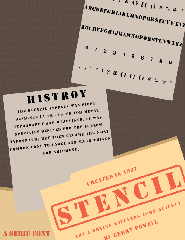 I picked the typeface "Stencil". I thought it looked like a typeface used for a murder file, so I decided to make the theme based around a file. I learned the difference between a typeface and a font, and different text settings Adobe Illustrator.
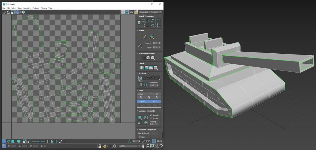 UVW Unwrap on Tank In this assignment I learned how to move the bitmap images to make everything match up. When I originally put them on the box, they didn't line up with each other. I also used lights again to get more practice, and also because it's fun to see what it adds to the piece.
This quarter was fun because I got to use my previous knowledge of Procreate and transfer that to Photoshop. I also learned a lot about colors and techniques I didn't know before. Composition techniques, for example. I knew what some of them were before this quarter, but I learned more and I learned how to use them. I also learned a lot about elements and principles in designs and how to incorporate them to make a piece more interesting and creative. All the projects this quarter have been really fun to make since I was able to focus a lot more on creating them than learning the software. I'm excited for the challenges the next 2 quarters will bring!
 Images(all were taken by me)
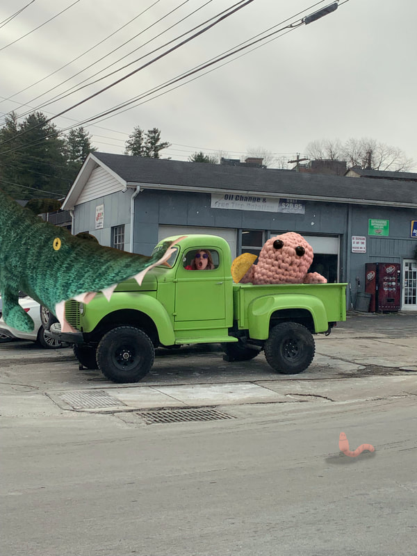
--> Green truck(background) --> Crochet Dobby attempt --> Mini Taco --> My face --> Alligator socks I used the layer mask and brush/eraser tools the most for this project. I did most of it at home on an ipad, but if I had done it on the computer I would've used the subject select tool so I didn't have to erase all around the subject. As for composition I added shadows to make the image flow together better and add depth. I also drew a quick little worm in the foreground for funzies. 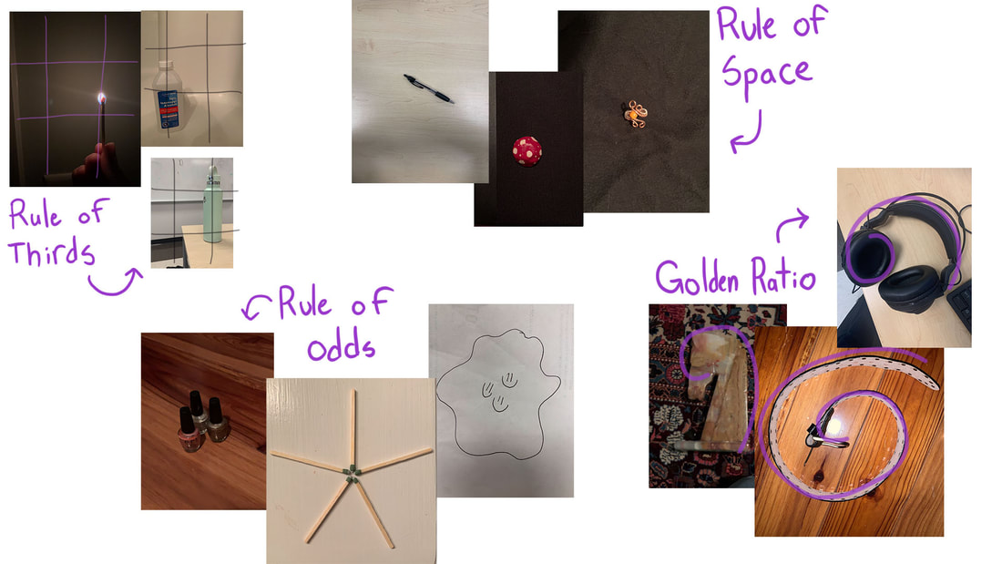 I learned how to use composition techniques and why you'd use them. The rule of thirds balances the subject with negative space and emphasizes it. The rule of odds works because odd numbers are more aesthetically pleasing to the eye. The rule of space adds a feeling of action to the subject and leads your eye to it. The golden ratio is easier to process and therefore makes it more pleasing.
For this I picked a character named Globox from a game I used to play a lot and changed up the color schemes(the second slide is the original colors). The left one uses complimentary colors. Complimentary colors are on opposite sides of the color wheel, for this I used orange and blue. The middle uses a monochromatic color scheme, I used different values of one purple hue. The right uses analogous colors, colors that are next to each other on the color wheel and I used greens and blues. I've been trying to work on how I color things because I don't do it often, and I definitely need more practice but I think that I did a good job on this.
|